Back to Case Studies
Redesign of Institutional Website for International Organisation

Case Study

Redesign of Institutional Website for International Organisation

Challenge

The European Forest Institute (EFI) was looking for a redesign of its institutional website. The focus was on modernizing the visual identity, rethinking the information architecture and improving the User Experience.

Client

European Forest Institute (EFI)

Skills

UI/UX Design

Development

Year

2020

About

The European Forest Institute (EFI) is an international organization supporting research and policy support on issues related to forests. The organisation was established by the European States and so far 29 States have ratified the Convention on EFI.

The Communication department was looking to modernise their institutional website with a new visual identity, and improved User Experience.

Discovery Phase

The EFI Communication department contacted us with some concerns regarding their website. They were having problems presenting their new departments and organizational structure.

The information was spread around the website, not well structured, making it harder for their audience to navigate and thus understand what they do. The overall look and feel was outdated, and the sections they had available in the back-office did not serve the content and copy.

We recommended following a simple UI/UX process aiming to come up with an information architecture that reflected the new organization and that favoured the user’s experience, making sure the audience understood what EFI was doing and that the users could easily access the information of their interest.


Tech Stack

EFI was not looking for a rebuild of the website, but rather looking for a new design. Marzee's team had to work on top of the existing Drupal website.

Even though we were keeping Drupal for the website, we recommended an infrastructure update looking to improve site performance and facilitate its maintenance and evolution.

We have migrated the source code to a Version Control System, in this case, GitHub, and we have migrated the hosting to a Cloud-base service, Platform.sh.


Tech

Drupal

Tech

Platformsh

Project Highlights

Marzee intervention in the project was highly focused on improving the User Interface and overall User Experience of the website with two main audiences in mind: the EFI editors that were using the website and the audience that was accessing information.

We present below the steps we took to arrive at a new version of the EFI website.

  1. UI/UX Process

    The first step towards working on the redesign was to follow with a detailed analysis of the current information architecture of the website. We were able to identify duplicate pages, have a better understanding of how information was organised and spot what was not clear.

    Website Structure Analysis

    This analysis made it possible for us to come up with a series of questions to the Communication Department aiming to have an overview of how they see the organisation, how they wanted it to be seen, who their target audience is and the message they wanted to share with them.

  2. Target audience

    Together with the EFI Communication Department, we identified 4 main target groups for the EFI website: researchers, journalists, policy-makers and civil society.

    In addition to this, we used Google Analytics to have more details on the website's users. It was interesting to have more information on their demographic, the type of devices they were using, how users were landing on the EFI website, and other relevant insights.

  3. User behaviour

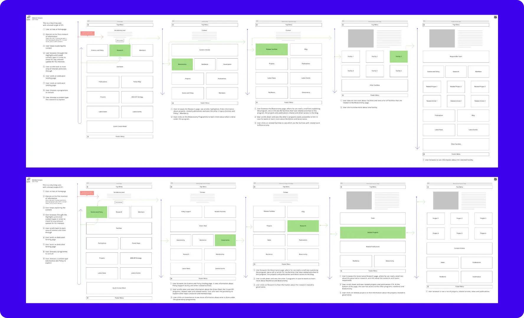
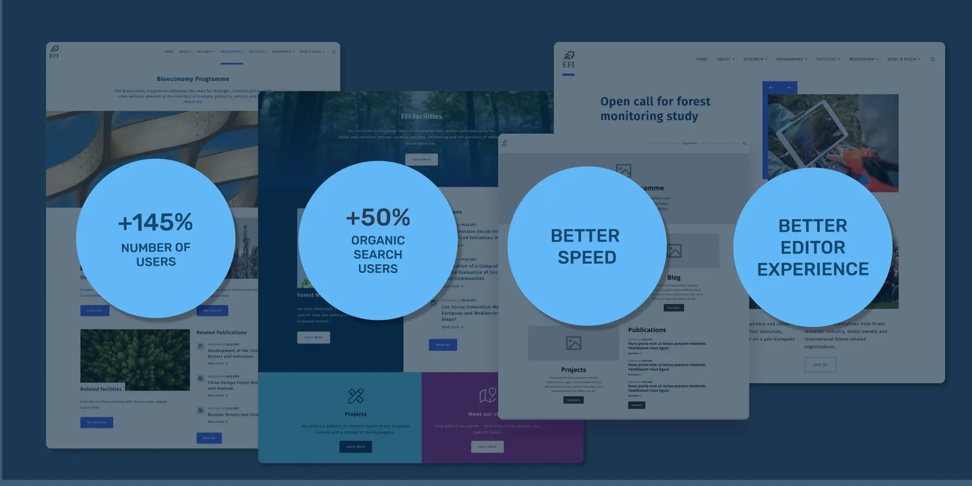
    The next important step of this analysis was to understand the users’ behaviour inside the EFI website. Looking into having a more realistic idea of user experience on the website we dove into Google Analytics.

    We were able to identify which were the main visited pages, the ones with a higher bounce rate, user journeys inside the website, time in pages and general user engagement.

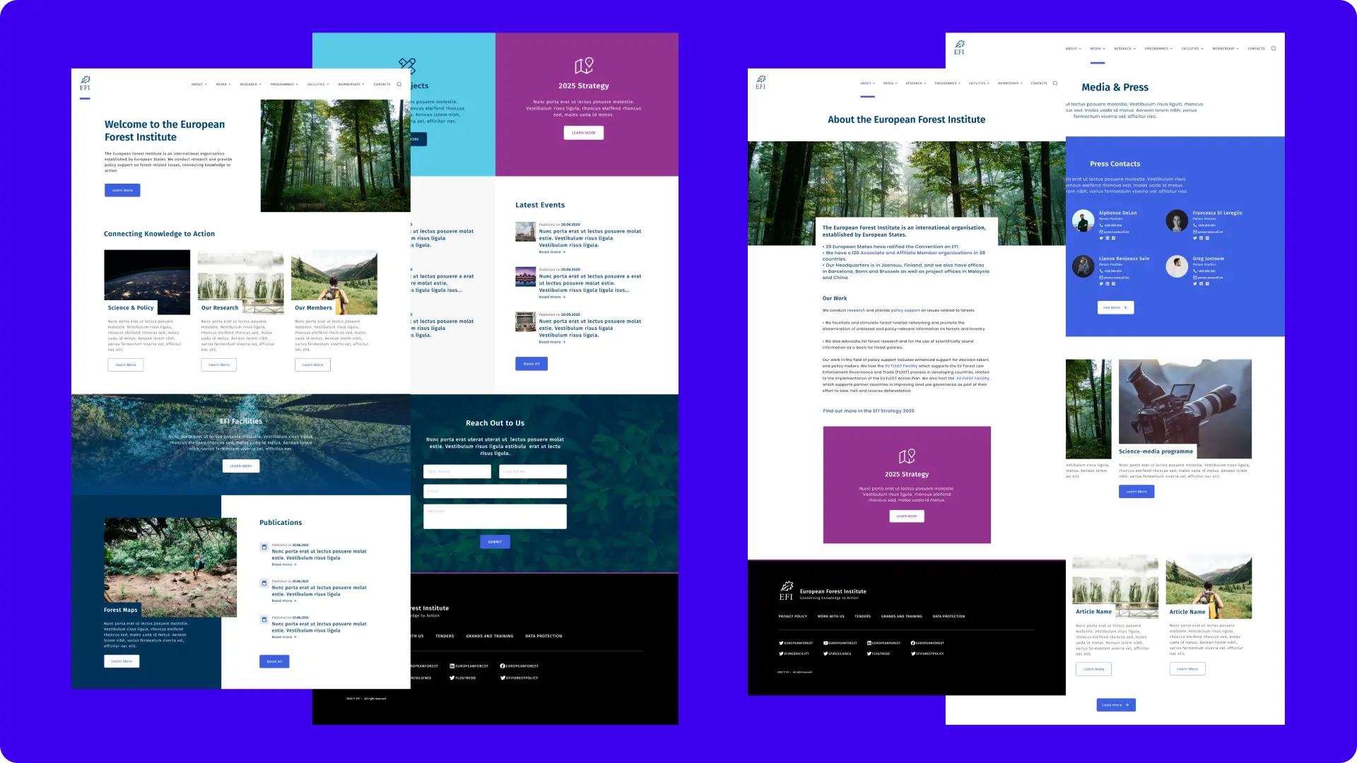
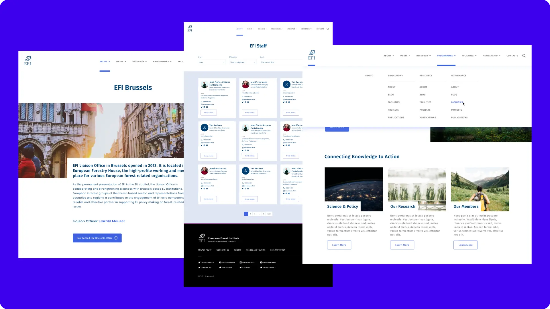
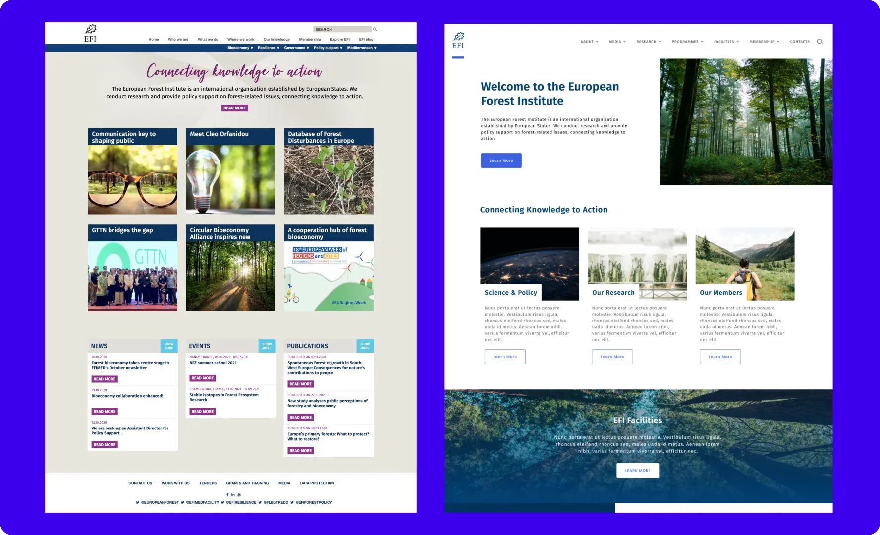
    With this analysis, we had a more clear idea about the pages that needed more attention from a UI/UX point of view and which information should go to the homepage aiming to increase user engagement on the website.

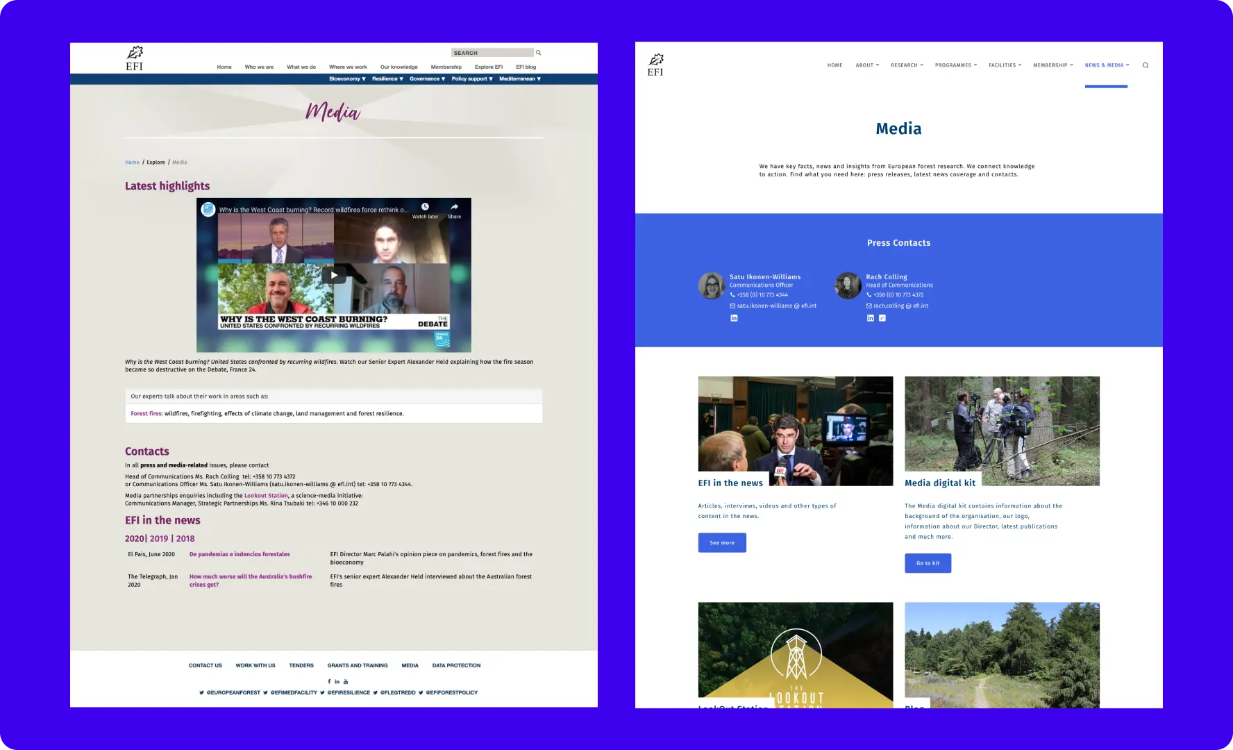
    For instance, we've noticed at this stage that the News page had a very high bounce rate, which could be explained by the fact that people were right away clicking on the top of the page article, meaning that they were not exploring other articles and news.

  4. Information Architecture

    While we were looking into user behaviour, we were also looking into how the Institution was organized internally. This enabled us to start thinking about the new information architecture that reflected the changes in the organisation and the target audience's needs.

    It's important to bear in mind that we were working on a redesign, so even though we were creating a new structure for the website it was important to understand how we could rely on the current structure.

    We identified 3 main topics that represented the work that the Institution delivers: Research, Members, and Science and Policy.

    From there we were able to start thinking about the user journey to meet EFI objectives with the website reflecting both the organisation's structure and the user needs.

  5. User Journey

    The following step was to create user journeys for the website having in mind the target audience, the organisation structure and the user behaviour.

    In a series of discussions with the EFI team, we perfected the different user journeys and came up with the new blocks and components we were maintaining and the new ones we wanted to create. 

    During this process, the objective was to provide users with a smooth experience while making sure they could easily find information of their interest and understand what EFI was doing.

    User journey diagrams
  6. New Design

    With all this insightful information in our hands, the design team started to actually start working on the design. We started with low-fi wireframes for the main content types, with a special focus on the new ones and the ones that we wanted to change the structure.

    High Fidelity Wireframes

    After a series of interactions with the Communication Committee - a group of around 15 people - we arrived at an optimal structure for the main content types and it was time to start working on the layout. 

    Our design team jumped into giving colours and style to the wireframes using the current visual identity of EFI. We prepared a series of mockups that were presented and discussed with the Communication Committee and finally presented to the high-level decision-makers from EFI.

    Two wireframes

    Four wireframesThree wireframes