Welcome to our new website! We truly hope that you enjoy it.
It took us much longer than anticipated to launch this new website - more than we typically take on customer projects. As they say, "the shoemaker's son always goes barefoot.”
Throughout the entire process of building this website, our motivation was to create a digital presence that is as flexible and dynamic as our team. This is reflected in our design and tech stack choices.
Building websites from scratch is one of the things we do best (cough cough), so we decided to share a bit of our journey building our own. If you are considering building a new website or redesigning your current one, we hope this will help you and make this journey smoother.
Assessment
Our website is an important entry door for new business for us. Being a web development boutique, how we present ourselves online tells a lot about our work and what customers can expect when working with us.
Once we decided we wanted to create a new website to match our new brand, it was clear to us that we had to walk the talk and show our customers and audience a good quality website. Our team put a lot of thought and effort into the preparation phase before starting to work.
- We started with a simple question: Why Do We Need a Website or Redesign? This is an excellent way to keep the focus on your goals and avoid getting sidetracked.
- Once we understood our why, we then went through the process of Identifying Our Target audience. To whom we were building this website. It's essential to clearly understand who you're trying to reach and what you want them to know about your brand and your work.
- We then started thinking about the Message We Wanted to Pass to that audience, how we wanted to be seen and, most importantly, how we could prove that we were good at what we do. A big part of this message was thought through during the brand creation (Check how we created our new brand), and we had to transmit that into the new website.
- Since we already had an online presence, we took some time to Evaluate Our Old Website and list the features and aspects that we felt were working well and what we felt was missing.
- It was also very important in this whole process to follow up with a Competitors Benchmark to try to understand what companies in our industry were doing. We also look around on other types of websites to get references and inspiration. This gave us some valuable insights and helped us to avoid repeating mistakes or missing out on essential features.
- The final step of this preparation phase was the List of Features and Functionalities we wanted to have on our website. This was like creating a wish list like we could do everything we wanted. The list was later prioritized, and we selected the features that were a MUST and the ones that were a NICE TO HAVE that could be implemented later on. It is important to focus on the most critical elements first.
Some of those steps were done together with the entire team. Being a small team, we wanted to have everyone involved in this process to some extent. After this first assessment, we started to divide and conquer and had dedicated team members responsible for transforming our new website into a reality.
Design
We were excited to dive into the Design Process for our web project. UI/UX Design is a critical aspect of any web project. We had a multidisciplinary team involved, but the designer was the show's star, responsible for creating the visual representation of the message we wanted to pass on to our audience.
It was essential for the designer to clearly understand the project's needs and expectations to convey our message visually and structure the content accordingly. We aimed for a concise, engaging design with the right tone.
During this phase of the project, we followed these steps:
- We adopted a user-centric approach right from the start. We focused on how our target audience would perceive and interact with us. This is why we began by working on the Information Architecture, deciding on the pages, sections, and components needed and creating a first draft of the copy.
- Next, we created low-fi wireframes to provide a rough, low-fidelity representation of the layout and functionality. It allowed us to test and experiment with ideas before investing too much time and effort into the design. We also considered the general user flow at this stage.
- This phase was critical as it laid the foundation for the whole landscape of components to be used: creating a Design System. We built a library using Figma that included design patterns, guidelines, and examples. This library was a single source of truth, ensuring coherence between all UI elements and setting the groundwork for scalability when introducing new components.
- Once the design system was defined, we built the layouts in High Fidelity. We applied the UI to the lo-fi wireframes created until then. At this stage, the design was fully tested for compliance with accessibility requirements, and we drew more refined conclusions regarding the content display.
We used Figma throughout the process, which made it easier to collaborate with the team and make iterations. After a few iterations, we had an optimal version that our developers could work on.
Development
In the project's development phase, we focused on selecting the tech stack and implementing the designs. We worked in sprints based on a product backlog with user stories created by our project manager.
Choosing tech stack
As the design phase progressed, we started investigating which technologies would best fit the website we wanted to build. Our developers were able to determine this based on the results of the previous phases.
Choosing the right tech stack has become more important than ever in today's world, as so many options are available. At Marzee, we have a meticulous process in place for selecting the right tech stack. We consider various criteria, such as the project's requirements, the team's expertise, availability of resources, costs, performance, security, and scalability.
We wanted a simple, fast, and beautiful website for this project. We adopted a modular approach, breaking down the website's components, features, and functionality into smaller, reusable components. This approach allowed us to reuse components across different parts of the website, facilitating collaboration among developers and designers, making it easier to test and maintain what was developed, and ultimately allowing for improved performance and reduced page load times.
Our developers advocated for Astro, an all-in-one web framework for fast, content-focused websites. They were looking forward to trying out the fastest content-focused framework out there. Three things caught our team's attention: server-side rendering, performance results, and flexibility.
With the simple website we were going for, we did not need a fully-fledged Content Management System (CMS), but we wanted to enable non-technical team members to work on the website. We extensively researched different CMS options and ultimately chose Sanity due to its robust features and ease of use. Sanity also had great documentation and a very generous free tier.
In addition to Astro and Sanity, we also decided to use Netlify for our project. Well, we always do. Netlify's seamless deployment and hosting capabilities usually is our go-to Content Delivery Network (CDN). We also used various libraries for animations, which we discussed more in-depth in another blog post (coming soon).
One aspect for improvement was the form we created for potential customers to reach out to us. We used Netlify’s form, which turned out to be not the best option due to the Forms’ issues with Astro. We found a solution (hot-fix) and created a single page for our contact form. We are still considering how to change this for the future.
Development process
Before starting with the development phase, the project manager created a product backlog with details on all the features and functionalities to be built by the team. These user stories made the development process smooth and transparent. Before building the website, the team had to prioritize the features and functionalities that would be part of the first website delivery.
For the code repository, we used GitHub (GH) and utilized its Project Management boards and sprint planning features. GH is usually our choice for Version Control System, but we have started using Notion Projects and are loving it for project management.
We started implementing the designs. We followed the agile methodology and worked in sprints to ensure we were on track and delivering results within the set timelines. One small note: this was an internal project, and our main priority was on our client’s projects. This means the sprints would happen soon after our team caught a break from other projects. This is not usually how we work, but it was how we managed this and a lesson learned not to repeat it.
Another critical point in making the whole development process transparent and agile was to have a staging link right from the start of the project. Everyone involved in the project had access to it, and we could see the progress being made, give feedback, and make changes and small adaptations when we felt it was needed.
During the development phase, the marketing team was able to start inserting content. This helped them get used to Sanity and contributed to more realistic feedback rounds. Overall, the development phase was a collaborative effort that involved the entire team working together to achieve the project's objectives.
Quality Assurance
During development, one or two developers tested every feature and functionality. All code went through code review, and in the end, we did a final sprint for testing and ensuring the website was working as it should.
The usability and accessibility testing was already done during the design phase, as described above. For general tests, we used the user stories and the acceptance criteria created by our project manager to guide us.
- Functional testing: confirm that all the features were working as expected.
- Performance test: check speed load and other scores using Lighthouse.
- Cross-Browser and Cross-Device Testing: Test the website on various web browsers (e.g., Chrome, Firefox, Safari, Edge) and devices (desktop, mobile, tablet) to ensure compatibility and a consistent user experience.
Go-live Preparation
We were all set to make the website live on the staging link, but before we proceeded with it, two crucial things had to be carefully considered- redirecting to the new domain and SEO. Since we planned to change the domain, ensuring that our SEO ranking didn't take a hit was crucial. Therefore, we decided to use 301 redirects to inform search engines and browsers that the original URL had been replaced permanently with a new one. Here's what we did:
- List of all the pages from the current website:
- If the URL structure of a page was kept the same, confirm the 301 redirect was working.
- When the old page URL is not on the new website, create a redirect to the most appropriate page.
- List the pages indexed in Google to ensure we had redirects in place for all of them.
- Use Netlify to redirect everything, following the steps in their Netlify Documentation.
- Notify Google about the change on the Console’s Change of Address tool.
- Ask Google to reindex the new domain so old pages don’t appear. This was done directly in the Google Console, following the steps available in the Google Console Documentation.
Last but definitely not least, we took the time to work on making sure we had considered best practices for better SEO ranking and pinpointed what needed to be improved. The marketing team made sure to go through the following:
- To optimize the new website for relevant keywords looking to rank higher in search engine results and attract organic traffic, we follow with a keyword search using tools such as Google Keyword Planner or SEMrush to discover popular and less competitive keywords
- We tried as much as possible to optimize meta title tags and meta descriptions on each webpage, incorporating relevant keywords and compelling calls-to-action to entice users to click through from search engine result pages (SERPs)
- Ensured the URLs were clean, concise, and included targeted keywords
- Alt Text: Provide descriptive alt text for images, utilizing keywords where appropriate
- Confirm Page Speed Optimization (with the stack we used, it was hard not to have a great result here).
Result
Well, it was a long journey until we had our website live. But guess what? The work continued beyond launch.
The first phase was a strong base for what we wanted to achieve. Building it in a modular approach also gave us the flexibility to iterate, change and adapt the website to new trends and needs. We are happy with the result and proud of how we got here. We hope that by sharing our journey, you know what to expect when building a new website or redesigning one.
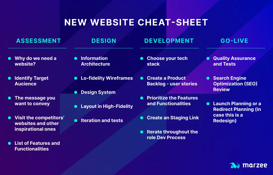
To summarise everything we have shared here, we have prepared a small cheat-sheet so you can use this on your project.
I would love to have your feedback on this. Reach out to me through LinkedIn, and let’s chat.